Advertising

Saturday 7 May 2011

Organic Architecture

I know that this subject doesn’t fit exactly in the area of home decorating, but you can certainly find some interesting ideas on how to bring nature more into your home.
It is an earth house and it's wonderful; close as can be to nature and extremely low-impact as it’s dug into a hillside. It was actually a DIY project, handled by people with no skills and qualification in building or carpentry whatsoever, but with a huge amount of perseverance and self-confidence. The house cost about £3000 to build and it’s made of wood, stone, straws and other recycled materials. It uses solar panels for energy (lighting), water from a nearby spring and a compost toilet.
It’s a way of embracing nature, a way of life and it takes courage and determination to complete such a project…but the result is beautiful and we can certainly take it as a fine example of architecture.


For more info visit this link.

Thursday 21 April 2011

Wall Tattoos


A unique way to decorate your walls is by graphic, which can either be as wall decals (vinyl stickers) or your one “home-made” wall art. 
Wall stickers are the “new thing” in home decorating and give a contemporary look to a room; they come in any colour and design so there's something for everyone.  Apply some floral designs on one wall in a room for a lively and playful feeling, or add a cheeky quote in the bathroom for fun. You can combine a few elements to create a scene in the kids’ bedroom. The possibilities are limitless. They're also easy to apply and to remove.
If you’re feeling in an arty mood you can create a wall design yourself; all you need is some acrylic paint, brushes and a steady hand. Be careful though, it’s harder than it sounds and paint is not removable.  Decide on the design, draw it by crayon on the wall (use an eraser if you make any mistakes) and then just go over it in acrylic paint; you can also opt for stencils.  


Thursday 7 April 2011

Planning colour schemes

Inspiration would be the first step, and the source could be drawn from a magazine, or a certain decorating style like rustic, which is inspired by the wild, or nautical if you love the seaside. You can even make a collection of little inspiring objects that tickle your decorating senses and please your eye. Inspiration could even come from the combination of colours on a cushion, a flower bouquet or a painting. One of the most important sources is nature itself where the colour and texture combinations are limitless.


Once you analysed the source of your inspiration, you will discover which colours are right to create the mood that you’re looking for. Decide upon the main colours for the room, the walls, the ceiling, the floors are the main areas; and think ahead if you need to use colour to create certain illusions, such as high or low ceilings. You don’t have to be inventive, if you’re not sure of yourself use colour schemes that you're certain of their success.
Decide if you want to use one or more colours on walls, but keep in mind that lighter and darker versions of the same colour would be a better option than using several different ones. Be bold and go for patterned wallpaper to emphasise a wall and to add texture to the room; but choose one preferably in the same tones as the rest of the room. Take into account that large patterns work best in large areas and small patterns are best appreciated in small areas.


There are a number of options for flooring as well, a new wooden floor will give a room a contemporary and clean look or if the current flooring is in good condition, it can be painted or striped and stained. Any of these possibilities will provide a good base for colourful rugs. Another option is carpeting, if a new one is not optional, than you have to plan your colour scheme around the existing one. 


Sunday 3 April 2011

Lighting in Home Decorating

Light is extremely important in home decorating as it influences the appearance of a colour.  Every colour can be enriched, toned-down or highlighted with the right lightning. A room in warm colours and soft lightning can create the most relaxing atmosphere; and a room with cool sharp colours and bright light can be extremely stimulating.


Getting the lightning right is absolutely vital, so make the most of natural light and use artificial one to create the desired effect.  A room can be filled with light and warmth if it is facing north and the walls are painted in a warm yellow.  If the windows are small, you can intensify the light in the room by painting the frames white and use pale warm colours for the rest of the décor. Coloured glass can change the mood by glowing in a room, and the sun shines beautifully through the glass.


You can easily transform your living room, from a playroom for the children at day time, to intimate atmosphere in the evenings by clever lightning tricks.  For a soft ambient use dimmer switches, concealed lights, table lamps and up-lighters; use spotlights for work areas such as TV, hi-fi and game consoles; and small spots to emphasize art, flowers and other accessories. 


Saturday 2 April 2011

Paint Effects


It often happens that you get tired of your home and want to make a change, but you’re not ready to chuck everything and buying new furniture just yet, besides that means spending a fortune. Well, there’s nothing a fresh coat of paint can’t do! And is the cheapest way to change the look of a room.  Decide on what kind of atmosphere you want in that room, and choose the colours accordingly. You’ll find that paint companies produce ranges of coordinating colour themes:  tropical, natural, ethnic, spicy and so on.  So it would be difficult to get the right colour combination.
Different paint effects can easily be obtained nowadays with the help of many ranges of products that enable beginners to apply colour effects such as rustic, antique, metallic. So there’s no reason why you wouldn’t give those kitchen units or that old wardrobe to a more contemporary feel.
You can go for Metallics to get that fresh, young style. There are several metallic acrylic paint ranges that can be used on most surfaces, like walls and furniture.  You can transform that boring bed stand in a bold and contemporary item by painting the wood surface in shimmering silver and changing the handles.


Bright colours are bold and look fabulous with simple furniture and vibrant fabrics. The best way to go is to pick harmonising shades like crimson, red, orange and create contrasts between them.  To avoid visual unease don’t mix high contrasting colours in equal quantities, like green and red or blue and orange.  Use bright colour accessories like cushions, throws and lampshades to harmonise the whole room.


Chalky colours create a matt texture on walls. The colour dries lighter and you can vary their strength from a thick textured matt covering to a soft colour-wash.  Pale chalky colours are cool and sophisticated and bight ones give a youthful, island look.


Thursday 31 March 2011

Creating illusions in home decorating

In strangely proportioned rooms, colour can be your best solution, this mostly happens in houses that are converted in flats. When a large area gets divided in smaller ones, the result might be an unusual one, for example high ceilings can make a room feel smaller, so the cheapest way to improve it is to use colour cleverly.  Also, light painted walls reflect light, so the room will appear larger and brighter, while dark painted ones will have the opposite result.
 
  •    Make low ceilings seem higher by painting the walls in a dark colour and the ceiling in a light one or white, floor length drapes will also help.
  •   High ceilings painted in a darker colour than the walls will reduce the height of the room
  •   To make a room that is long and narrow look wider, paint the longer walls in a cool blue or green, so that the walls appear to regress and paint the narrower walls in a deep, warm shade, and they will appear to advance.
  •  If a room is small, paint the walls in a warm colour to create a feeling of cosiness and add mirrors to create an illusion of space.
  •  In a small house or flat, link the colour of the corridors to match with the room colour and remove doors to achieve an open-plan area.
  •  Pint undesirable pipework the same colour as the background, preferably in a matt finish paint because the shapes don’t catch the light as much.
  •   Make a simple square room more interesting by adding blocks of colour, stripes, stencilled moulding and designs.
  • Striped walls can help to visually spread out a room and make it look larger or higher, and will also give a very contemporary look.

Wednesday 30 March 2011

Silver


As a metallic, silver is the colour of the moon, it symbolizes security, intelligence, maturity, conservative, balance and also has a feminine influence.  For instant cool in a room, silver is the right colour to choose, it is sharp with a reflective mirrored surface and it compliments most other colours. 


It is the colour of metals such as stainless steel, aluminium, chrome, tin, zinc and galvanised steel; and they have been making a stand in home decorating since the appearance of the industrial style.  Silver is mostly preferred in the kitchen, where it dominates as stainless steel in sinks, appliances and work surfaces.  Chrome also has its place in the kitchen as the metal of toasters, kettles and food mixers.


 In other parts of the house you can introduce silver as accessories or even on walls matched with other colours such rosy pink, purple and lilac. It works well with soft fabric textures that share silver’s reflective abilities like silk and velvet. For a soothing and relaxing result mix silver with white and lavender and add some crystal accessories and mirrors, this will give the room an air of elegance.


Tuesday 29 March 2011

Gold


Gold is the richest and most luxurious metallic colour and it’s perfect for framing and emphasizing in decorative schemes. Gold was used in Europe from the 16th century onward for furniture gilding; the late Victorian designers were inspired by the Chinese style as they used gold in filigree patterns on red and black lacquered furniture.
Although gold is a bold colour you can tone it down by using it in low quantity and instead of the high gloss finish go for the antique gold which looks classic matched with pastels. Gold also works well with earthy colours such as cream and dark brown if you want to go for glamorous, or as a highlight on white painted wood. 


You can use gold when you want to make a big impact as part of an ethnic-inspired colour scheme, but just as a finishing touch. India, Morocco or Thailand cultures can be the perfect examples and can be used as inspiration for colour schemes as their fabric and accessories are often patterned with gold.

Sunday 27 March 2011

Black and White – Sophistication

Black and white offer a solid contrast and if you are brave enough to use them over large spaces, they can make a bold statement. Black and white were extremely used in the 1920s, especially for party rooms, and in the late 1950s and early 1960s by artists who painted their studios white (due to the ability of white walls to reflect light) , and the youth culture which adopted the style for their homes.
 The theatrical effect of black and white can be cold and plain sometimes if not spiced up with colourful accessories and exciting paintings to contrast the light background. 


The Japanese style is quite successful in the West as it’s a great example of strong contrasts. The difference is that black is impersonated by a very dark brown and white has a shade of yellow or cream.  The Japanese have also perfected the art of minimalism by using just a few pieces of wonderfully shaped furniture whose shape is exposed by the strong contrasts between the dark objects and their light backgrounds.


Friday 25 March 2011

Hot Pink – Passionate


Passionate pink is a feminine colour; it’s hot, spicy and a courageous choice for home decorating but will grant a room instant sex appeal and vitality. It is the colour of dazzling cactus colour flower, where extreme visibility is needed to attract pollinating insects to ensure the plant’s survival.


It gives an exotic appeal as the colour pigments have been made in India and the Far East for centuries.  The best examples of beautiful hot pink are Indian saris, Chinese silks and shimmering satins. It’s the perfect colour for a love nest, but is also a fun colour to use in other parts of the home.  Because, like red, hot pink will make a room look smaller, it should only be used where that is the desired result.


In the East this colour is frequently used with gold, but this should be done carefully, as an extra, or the effect may not be pleasant. Mixing it with other strong colours, like crimson red will keep it spicy. With other intense colours like purple, emerald and peacocks blue will create an ethnic look. Patterns like swirls, geometrics and stylised flowers in hot pink, yellow, orange, apple green and white proclaim an allegiance to 1970s revival style. This colour is best suited for use in a room where there is limited natural daylight or where the room is mainly used in the evenings.


Pale Pink - Soothing and rejuvenating

Pale pink is a wonderfully flattering colour. It seems to suit all complexions and bring a warm glow into any room. This is the colour of the inside of a seashell, apple blossom in springtime, strawberry ice cream and many other pretty things. Pink is associated with sweetness and innocence. It is a life colour, a signal of health and well-being.


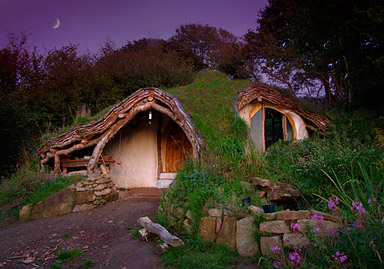
Pink is a colour well-suited for use over large areas. Its character is influenced by other colours- with dove grey, it is sophisticated; with pale lemon yellow, white and powder blue, it is nursery soft; but with faded aqua and terracotta red, it is typically Mediterranean. Pink is the natural colour of freshly plastered walls, a delicious warm earthy pink with a rustic character that is enhanced by deeper terracotta shades, natural wood and deep greens. Mixed with verdigris and ochre, it is reminiscent of faded pink villas on Tuscan hillsides.


Rosy pink is softer and sweeter, the colour of cascades of rambling roses around cottage doorways. Pink need not always be seen as exclusively feminine and can be very bold and striking in the deeper salmon shades that are tinged with orange.
It is easiest to imagine a colour when we have several sensory references. We recall the taste, smell, appearance, sound and texture and create a perfect imagine in our mind’s eye. It is impossible to think of sweet peas of also conjuring up their scent. Each of these pale pinks tickles the senses in a different way. Rose pink mixes well with deeper reds, white, sky blue, and pale and mid green. Salmon pink, black and cream create a smart look. Pale looks equally delicious in chalky distemper paint or high gloss.
Pale pink is an undemanding colour it live with and is useful for softening hard edges and creating a rosy glow. It is adaptable background colour that feels equally at home in the nursery or the office. Baby pink looks sweet with white or cream and other pastel shades, but it can also look sophisticated alongside steel grey; or funky with sharp lime green or turquoise. Pale pink with black shouts 1850s glamour, pink gingham has a cute French style and plaster pink is popular in the Country Style palette.